Encinitas, California. Eighties Series

Graphic Design

What do I know about Encinitas?

Beach town, fancy restaurants, lots of surfers, much about sustainability, boho, natural vibes, and the infamous Surfing Madonna tile mural you can read more about the piece here

So for the eighties series for the city of Encinitas, I was inspired by the waves and the tile art, as well as the typography used in the goonies poster.

I went straight to Illustrator, and decided to give the text a handmade tile look, encircle it in a wave and make the foam in the wave look tiley as well.

Here is the final product:

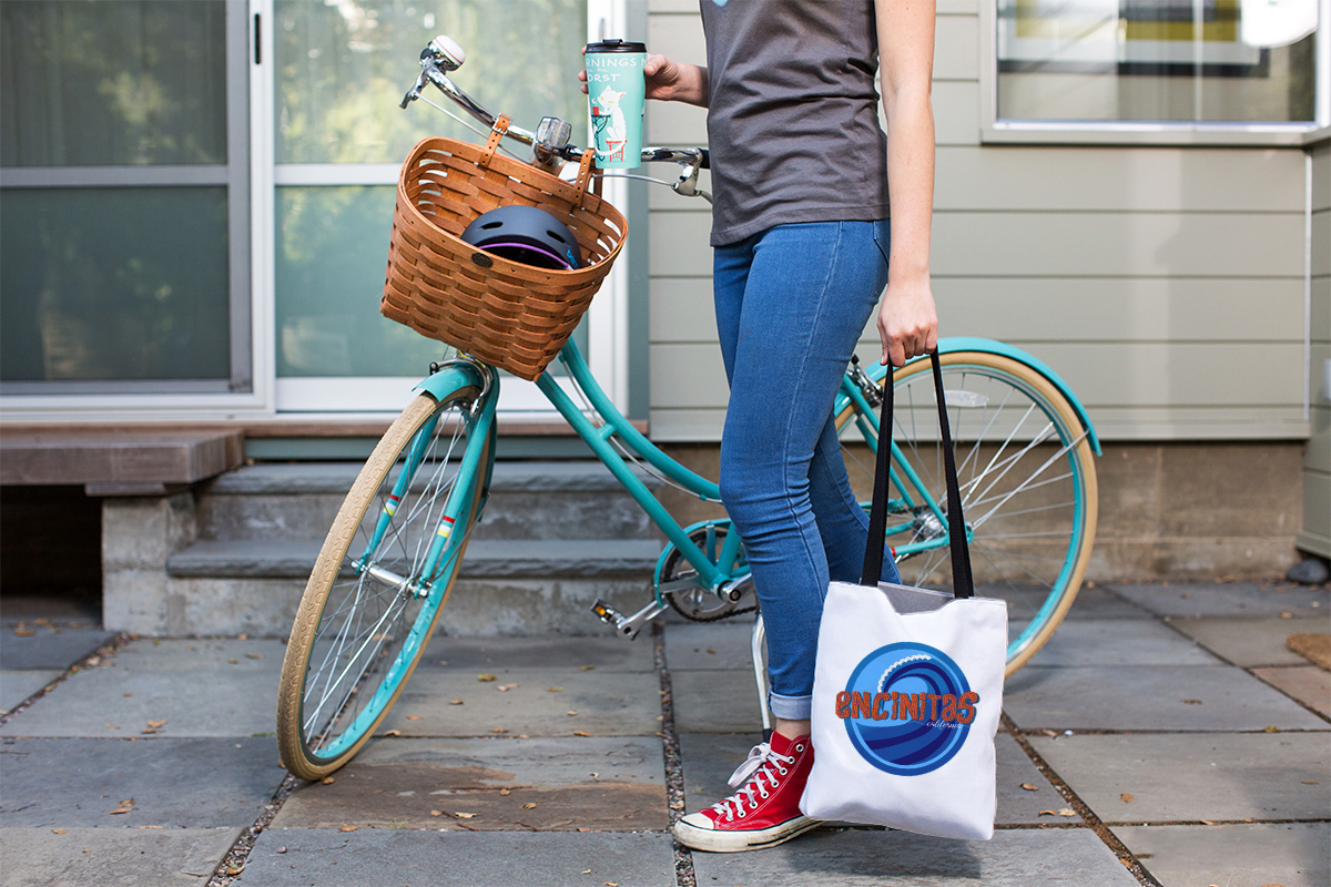
I imagined that both Encinitas locals and tourists would like the totes and maybe the t-shirts, what do you think?

If you would like to get your own t-shirt with this design or many other products with this design printed on you can find them on the redbubble page here

The collection of 80s designs also are available here

El Cajon, California eighties series

Uncategorized

I know people that live in this city, the city itself…not so much.

It is surrounded by hills yet it is a fairly flat terrain, hence the name. I always associate about 10 degrees or a little more in temperature, so I wanted to make the graphic reflect that warmth as well as the enclosed geographical feeling. The colors give it the warmth, the type reflect the encasement.

It was a very instinctive process for me, so it’s hard to explain the process, Much experimentation to reach the final look, which was to reflect the 80s era as well.

Check out my redbubble shop for other designs on this series as well as getting the design on other products you might be interested on.

Escondido, California Eighties inspired

Graphic Design, Uncategorized

The eighties was quite a hectic time design wise, patterns, colors, cutouts, and many of these designs were hand made.

Continuing the series, today I made a graphic for Escondido, California. I don’t know much about the city itself, it is north county San Diego, and beautiful for what I can tell, old houses with a lot of land, something you don’t see much these days. For the graphic I wanted to play with patterns, and contrasting colors.

I went ahead and tried a bunch of standard Illustrator patterns, and started to play with the the arm of the E, today was a big happy accident, for I liked how all my variations looked together, not as individuals but as a big unit. Take a look for yourself:

This still manages to look very eighties and I love it!
I believe it is because of the eclectic nature of the times and a play on colors, yet still works for 2020 (some would say an eclectic year itself).

Find that really cute pouch here or that cute t-shirt here.

My Pinterest board of inspiration for graphics from the eighties is growing, go check it out.