Many of us designers learn the hard way that files that work for digital printing don’t really translate to other methods of printing, say offset printing, which has a few different requirements, or large format printing, where it is more acceptable to work with lower DPI, or even screen printing, which is actually based in only vector graphics, it all depends on the end product and the process you chose to get it.
Let me talk about Screen printing.
There are several differences in the process, and in turn, the files need to be prepared for that. Most screen printers need vector files were the colors are separated, with very specific instructions when it comes to location, colors, pantone numbers, quantities to be printed, etc.; most of them now a days will list the art requirements in their website; if they are old school however, don’t hesitate to call them, they are the best! they will explain everything step by step, answer all your questions, and next time you will have a “camera ready” file (ever hear that one?). A lot of printers will charge you an extra fee if they have to modify your file, and if you want to avoid that you will want to check your file before sending it to print.
Here is a list of the things I always check when I get files from clients, or of course, when I’m building one. Like a wise man told me once:
“Practice good habits when you don’t need them, so that they will be there when you don’t have the time to think, which is when you will need them.”
So, make sure you always go through the list, it will save you A LOT of time when you are under pressure. With time, it will be automatic and you will be able to modify it to your best convenience, but for now, bare with mine:
1) Vector files. You know, the ones built with beizer curves. If you don’t know what that is, check the all knowing Wikipedia here. These files are usually built in Corel, freehand, or Illustrator.
2) All the text is converted to outlines (also known as curves). This converts the text into shapes, and you can’t edit the text anymore. Doing this will save you the hassle that comes when your printer doesn’t have the fonts in their system and there is font substitution, you will need to send them the font file, or you take the risk that the printer doesn’t notice the font substitution and the wrong thing will get printed. Can you imagine this happening on a tight deadline with no minutes to spare? nerve wracking and defeat come to mind; and trust me this will happen more than you think.
3) No unnecessary elements. This might sound obvious, but in time pressure, with several jobs on the docket, little things like this just slip through. Start by checking if there are no extra layers with invisible things that make the file larger and heavier. Then select all the elements, observe the curves, the points, this will show you all the elements and then you can delete the ones not needed on your art.
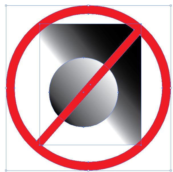
4)Stay away from gradients. Screen printing is done by hand, color mixing is by hand also, and is not an exact science, so a gradient will add increased chances for mistakes, and more importantly inconsistencies between the finished products. If you must have gradients talk to your printer, constant communication with them will increase the chances of getting the client the product they need.
5) Strokes vs. shapes. This is a hard one to explain; when you add a stroke to your shape, specially in Illustrator, it doesn’t translate well when you go to separate the colors and print a screen. The best way to understand it is to see it for your self. Go ahead, open illustrator, build a simple shape and add a stroke to it, make it a really thick one like 22pt or something like that. Now go to your menu, under view, there is an option to see the files as outlines or outline mode, click on it. All you will see now are lines that form the shape, like a coloring book. If you look closely, there is no outline for your stroke. That won’t print when the colors are separated. You want to make EVERY element shapes, and that includes the strokes that surround your shapes.
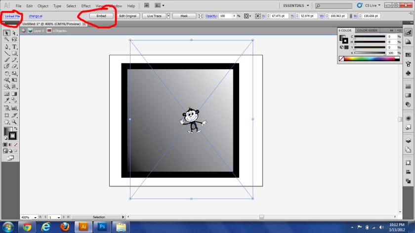
6) Embedded files. I am not talking about raster files (jpgs,tiff, png, etc) those are already “out of the picture” at least for the sake of this check list. But sometimes for whatever reason, we combine several files by just dragging them into one, without copying and pasting the graphics themselves, this is OK, as long as you remember to embed the files before sending them to the printer; and is an easy task, just click on the file, you will see just one big square surrounding your image; make sure you have the control menu on and see how on the mentioned menu the file name appears, on regular workspaces, at the top left corner of your screen, after the words linked file. Also in the same menu you will see a button appears when you select the file that says embed. just click on that button and voila. The file is now embedded and you don’t have to send several files to the printer.
7) Colors punched out and no overlapping shapes. For this the pathfinder tool is great. If you have a circle inside another bigger circle, the outer circle should be more like a doughnut; this way the colors don’t mix when they are painted onto the material.
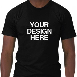
8) All the instructions are clear for the printer. You know what you want, and it might seem obvious what needs to go where, but the screen printer, has other things in their mind besides your job when they are starting to work on it, and to them a different thing might be obvious. As I’ve mentioned earlier: write down the quantity, the color of the shirts(or other product you want printed) what color ink is to be used with that color product (specially if you have several colors), etc. Be specific, if there are Pantone colors, give them the number, if there is a deadline, write it down for them. I often use a t-shirt template, I make it the color of the shirt we are using, and within this template, I specify the location of the print, write down the size of the print (if there is any) and show the print in the colors that I need, also include any notes or questions I have in this page, also include my contact information. They get the vector art on a different file. That way the screen printer can just print the page and see what I am expecting to get, compare it to the vector file and print, or call me if they have concerns.
Just think, if you are a screen printer and you get a camera ready file from your client, plus a sheet with all the instructions and they match, you wont have to lose time fixing the art, or calling your client to fix it, or to ask them for color, or sizing, etc. You can just go ahead and print. It will save a few days in production easily, and the job will more likely be delivered ahead of time.
There might be other things someone should look for, if you know of any, please comment 😀


